UX CASE STUDY
PACEBUDDY

HOW MIGHT WE...
find ways to jog together, so we can support each other on our journeys to better exercising habits?
Pacebuddy is your first step in the right direction for beginner joggers. It's no longer about the competition, focusing back to the basics - taking you on a journey to better running habits with the support of your friends.
Overview
It was reported that most people who had an urge to start running simply lacked one thing - motivation. The mental blocker in most cases were more of a reason than physical attributes that prevented consistency in running.
Pacebuddy is a support system at its core for novice runners. As important as tracking your progress is (and as it should be), we've also included a "nudge" system to make this journey easier, encouraging runners alike to simply stay on track and run together. The end goal is to ease a novice jogger into a polished runner - showing users that this activity isn't something that you should do, rather it's something you want to do.
Take your first step. Then a second step. All at your own pace.

Role
The concept came from a former classmate from General Assembly's User Experience program, and together we further fleshed out his ideas. Collaborating up with him provided a great study for me, simply because I wanted to gain more experience with other UI/UX enthusiasts and sharpen my skills with the tools and programs. After explaining what the project is and showing early sketches of his ideas, I was able to create several high-fidelity mockups. The project took about 3 weeks total, with constant check ups through Zoom and screen sharing. My main role in this project was an active User Interface designer, working with his ideas and finding solutions that could work.
Sketches

On the far left is the dashboard. A map can be seen with a few icons that indicate where the user is along with friends, with the lower end being the navigation bar. A volume control icon can be seen in the dashboard to access configurations on volume and time frequency of a status report when running.
The middle sketch displays how the screen would look on an active run. Current status shows distance, time, mile, heart race and steps. A pause button can be seen at the bottom, where the initial concept was to press pause, turning it into a "finish run" button, leading to the next page of the completed run.
Far right is a sketch of the finished summary of the run showing the overall status and run on the map, from start to finish.
NIKE RUN CLUB

C25K

Through competitive analysis, it was reported that although a variety of running apps existed, they had one thing in common - competition. This was the core and essence that drove motivation when it came to running. It was discovered through interviews that as a beginner runner, this was not the most efficient way for a novice runner to start their journey into a healthier step.
It was noted that C2K was only a set workout without any customization, while Nike Run Club was deemed too intimidating and meant for seasoned runners.
Wireframe//Low-Fidelity

Here's a snippet of the low-fidelity provided to me along with a basic outline of how the prototype would look. Through Zoom, we discussed how a user would run through the app and use it according to his or her needs - in this case, Lisa.
From start to finish, Lisa has navigated from the login screen, start a run from the dashboard, pace herself through a run, and eventually rating the and logging the activity.
Userflow

(P) = Profile (R) = Previous Runs (L) = Leaderboard (B) = Buddies
HAPPY TRAILS
At the very center of it all is the DASHBOARD, which will set her on a course to go running instantly by pressing Start Run. Additionally, it will also provide alert Lisa of nudges for motivation from her fellow Pacebuddies.
After an activity is logged, it is saved on the Runs page, where she can see all of her previous achievements.
The Leaderboard will provide a page where users can see how far along each other are doing, while the Buddies will show other Pacebuddies that Lisa has befriended. Lisa can nudge others for motivation there.
Wireframe//High-Fidelity
V.01

I was able to create and design several screens based on the low-fidelity mockups. Here was the tricky (but fun) part of the workload. Although my colleague had provided the guidelines previously, the details and thought process needed finesse.
FINDINGS
During user ability testing, it was reported that they had a hard time navigating between buttons because they were too cramped or not large enough. A request for more negative space or padding was made.
Furthermore, users did note that the idea of a leaderboard would ultimately go against the whole premise of the app, being a competition free running app.
With these in mind, I drafted up another version of the app.
V.02

My second rounds of high-fidelity consisted of minor tweaks from feedback.
Navigation now only consisted of three icons:
-
My Runs - a page to see your saved activities.
-
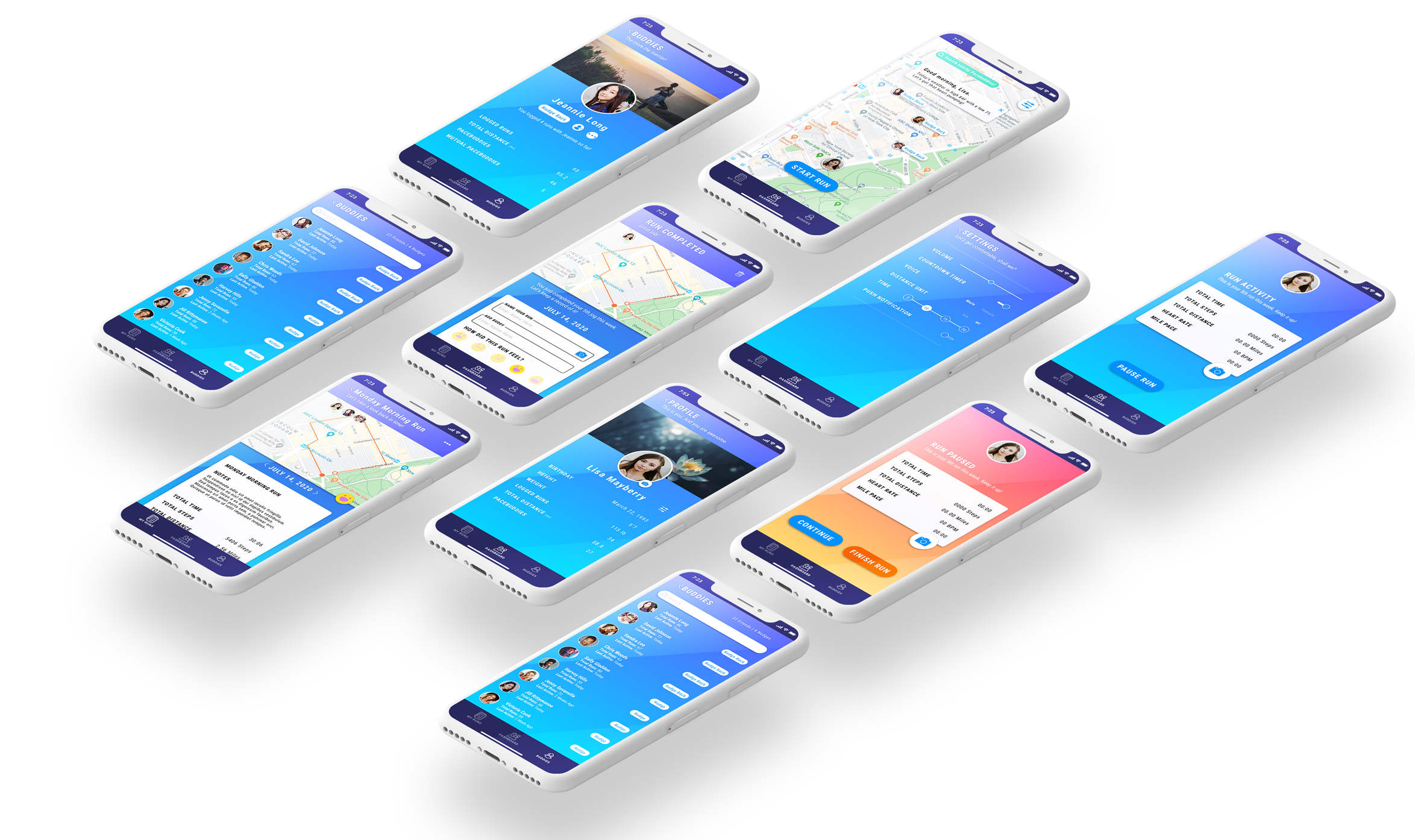
Dashboard - the default home page. This is the start of the app, providing the user with valuable information such as location/map, other Pacebuddies, and welcoming message with weather information when first opened.
-
Buddies - other Pacebuddies that are active, also showing nudges to and from other users for motivation.
When loading the dashboard for the first time, a welcoming message for Lisa is seen. It has basic weather information and encouraging words to motivate her. The miniature pop-up can be easily exited out.
Lisa's icon acts as both a profile button and shows her current location.

Initial thought process from low-fidelity showed this as a VOLUME button. However, I've decided to create a SETTINGS button instead simply to consolidate all settings in one section. The reason for this is for real estate purposes (less is more), and to avoid a user getting confused and having to go to two different settings.
Lisa can also see three friends that are already active on the Pacebuddy app, all of which nudged her to encourage her on a run. Alternatively, she can quickly search for more Pacebuddies that are nearby for motivation.

SETTINGS page was designed to consist of volume control, countdown timer toggle, along with how often Lisa will be notified of her pace during her run. For instance, she can set her running information every 5, 10, 15, or 20 minutes with a choice of male or female voice.
V.02 includes text size increase.

Vital information for Lisa is shown as she starts her run. A camera icon is added to snap photos as a bonus feature. On top is yet another cheerful and motivational reminder for Lisa. Hitting PAUSE RUN will provide options of CONTINUE or FINISH RUN.

When paused, a shift in color occurs so users are easily aware of the current status of the run. An option to continue or complete the run are displayed here.


After a run is completed, Lisa can log her activity including her mood, who she ran with, and upload photos and notes.
Trash option is now incorporated should Lisa decide to change her mind.
Jeannie Long and David Johnson can now be seen noted in the logged entry.
Page indicator - first image seen will be map, while the rest are the photos that Lisa can upload from her camera.
Lisa can now add which other Pacebuddies she jogged with in this run. In this instance she'll be adding Jeannie Long and David Johnson.
Although originally rating the run was its own specific page on low-fidelity mockups, incorporating mood options here made more sense, as it would be one less page for a user to submit.
Optional place for notes. Perhaps for Lisa, running can be not just a form or exercising, but a way to destress and meditation. She can gather her thought process and jot them down after, or simply notes of self progress or how she felt before and after a run.

Monday Morning Run is now saved and can be viewed from My Runs, showcasing all of Lisa's previous accomplishments. Each logged activity can be edited or trashed by simply pressing on the ellipsis on the top right of the screen.

My Runs consists of a timeline of logged activities. Search feature will look for keywords of Pacebuddies or titles of saved logs as well. Circular profile pictures of other Pacebuddies on the right of a log indicates who Lisa has jogged with.
V.02 includes more padding for readability between groups, bigger icons, and text size increase.

Buddies section is a list of friends within the app. Currently, Lisa has 27 friends, 4 of them having nudged her for motivation. Three states of nudges are noted - Nudge, Nudged, and Nudge Back.
V.02 includes more padding for readability between groups, bigger icons, and text size increase.

Jeannie Long's profile can be seen from the Buddies section by clicking her profile image. Lisa can see some of her stats and how she's doing on her runs, along with how many shared activities they have together.
V.02 includes a different layout of profile and bigger icons.

Conclusion & Plans
This was a terrific case study for me to branch out and sharpen my tools and thought process. Although it was a simple idea with some rough sketches, I was able to create a product basically from start to finish. My next step in the process would refine some more after rounds of user testing.
One main feature I'd love to incorporate in time would be straight from WAZE, where joggers can warn each other of an area if it needs to be alerted. Perhaps the dashboard could contain small icons that indicate there's a road block, pathway closed, or construction ahead to keep the community active and safe, or simply to avoid a blockage.
Thank you Steven Shi for the collaboration opportunity!
Also a very huge thank you to Lourdes Moreira for making the high-fidelity video come to life! You're one powerful wizard! 🧙♀️
Method & Madness
Adobe XD
Adobe Photoshop
Product Strategy
User-Centered Research
Data Analysis
Persona Development
Information Architecture
Sketch
Sketching
Wireframing
Visual Design
Rapid Prototyping
Identity Development
Copywriting
Graphic Design